search

Success Rate Analysis


The Success Rate  tab is broadly divided into sections: 

  1. Overall Summary: This section gives a high-level insight into transactions happening across all payment source
  2. Payment Source Level: This section gives a more detailed insight into each payment source available

Overall Summary


Here you will find the transaction Success Rate benchmarked against different time durations, such as:


  1. Historical Benchmarking


    • Yesterday: This shows the increase/ decrease in success rate on a particular day, as compared to the previous day.
    • Current Week vs Last Week: This shows the increase/decrease in success rate for a particular week as compared to the previous week.
    • Current Month vs Any other month: You can customize the date range to compare the success rate for your current vs any other date range. 


  2. Success Rate Historic Trend


    You can also view the graphical representation of these trends along with multiple filters to get a deeper insight into the payment data. Below are the filters which you could apply

    • Duration: Select the date and time for which you want to see the success rate trend.
    • View: Depending on the time duration selected, the data is displayed in different views, i.e. Hourly, Daily, Weekly, and Monthly. 
    • Overlay Layers: You can also add below overlay layer on the trend graph, to get an even more granular level of insights: 
    • Payment Attempts
    • SR Moving Average


    Overlay Layer-1: Payment Attempts  
    If you select “Payment Attempts” as an overlay layer, the success rate trend will be split into 2 parts: The total number of payment attempts and the success rate for any particular time duration. 


    Overlay Layer-2: SR Moving Average 
    If you select “SR Moving Average” as an overlay layer, the success rate trend will be split into 2 parts: The overall success rate and the Success Rate moving average, for any particular time duration. 


  3. Failure Reasons Analytics

    This section helps you understand the top failure contributors for your transactions. These failures may have happened by the user, bank, or Router. It also highlights the increase/decrease of these failures in recent times as compared to the previous time period.


    Failure Breakup: This is a doughnut chart that highlights the breakup of failure shares across the top failure reasons as well as others (which comprises all the remaining failure reasons) in the selected time period. This doughnut chart is sorted with respect to the failure share of each failure reason.


    View: This filter decides the time period for which the "Failure Breakup" chart will be created. These time periods could be: 

    • Yesterday
    • Current Week
    • Current Month 
    • Custom Range 


    Top Failure Reasons: This table highlights the top failure reasons (and others) with the corresponding failure share /transaction share for the following time periods:

    • Yesterday: This view provides the failure share/transaction share data for all failed transactions of yesterday due to that failure reason. 
    • Current Week: This view provides the failure share/transaction share data for all failed transactions for the week due to that failure reason.
    • Current Month: This view provides the failure share/transaction share data for all failed transactions from the 1st to yesterday of this month due to that failure reason. 

    You can choose the type of data you would like to check from the drop-down filter. Here you will find 2 options: Failure Share and Transaction Share. 

  4. Payment Source Level Analysis


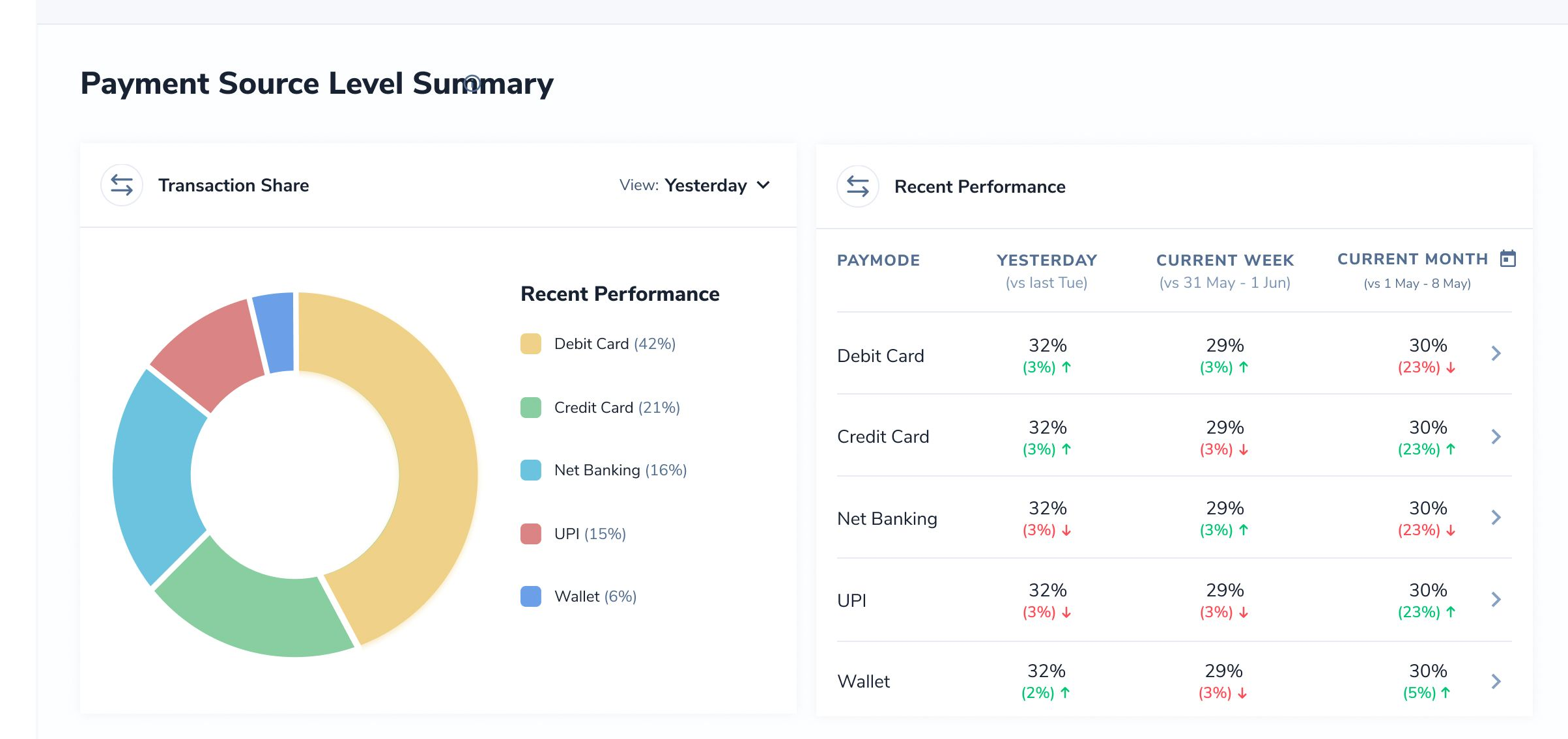
    This section helps you to find the top payment sources with respect to the share across all your transactions and the corresponding success rate performance for all these payment sources. Thus, it can be utilized to find the recent success rate performance of the payment sources which are of the highest importance.


    i) Payment Share: Payment share is a doughnut chart that provides the breakup of the share of the top payment sources across all your transactions. This chart showcases the share of payment for different payment sources (UPI, NB, Credit Card, etc) along with the cashier page dropout. Cashier Page dropout means the customer drops off on the cashier page without choosing the payment source to be used for completing the transaction. Here you can use the drop-down filter for different time durations and can see the data for the following time periods: 

    • Yesterday: This view provides the payment share for different payment sources for the transactions performed a day before.
    • Current Week: This view provides the payment share for different payment sources for the transactions performed in the current week.
    • Current Month: This view provides the payment share for different payment sources for the transactions performed in the current month. 
    • Custom date range: This view provides the payment share for different payment sources for the transactions for any particular time duration selected by the user.

    ii) Success Rate Benchmark: This table provides the recent success rate performance of the top payment sources, benchmarked against previous success rates in that particular time duration.

    • Yesterday: This shows the success rate of any payment source yesterday as well as the increase/decrease in the SR for the same day, a week before. 
    • Current Week: This shows the success rate of any payment source for the current week as well as the increase/decrease in the SR as compared to the previous week
    • Current Month: This shows the success rate of any payment source for the current month as well as the increase/decrease in the SR as compared to the previous month.

Payment Source Level Summary


Payment Sources tab provides you with the capability to analyze your transaction performance for specific payment sources.
You can see below the set of payment sources available as sub-tabs for selection: 

  • Credit Card 
  • Debit Card
  • Netbanking
  • UPI
  • Wallet

Access to the Payment Source-specific tabs

The payment source-specific tabs can be accessed via the below two methods: 
 

Overall Summary tab: Use the below steps to access the payment source-specific tabs from Overall Summary:

  1. Go to the Payment Source level summary section.
  2. Visit the Success Rate Benchmark table.
  3. Among the listed payment sources click on the payment source for which you want to see the detailed analytics. You will be redirected to the Payment Source-specific tab. 

Payment Sources tab: The payment source can be chosen as a sub-tab on the Payment Source level summary tab.


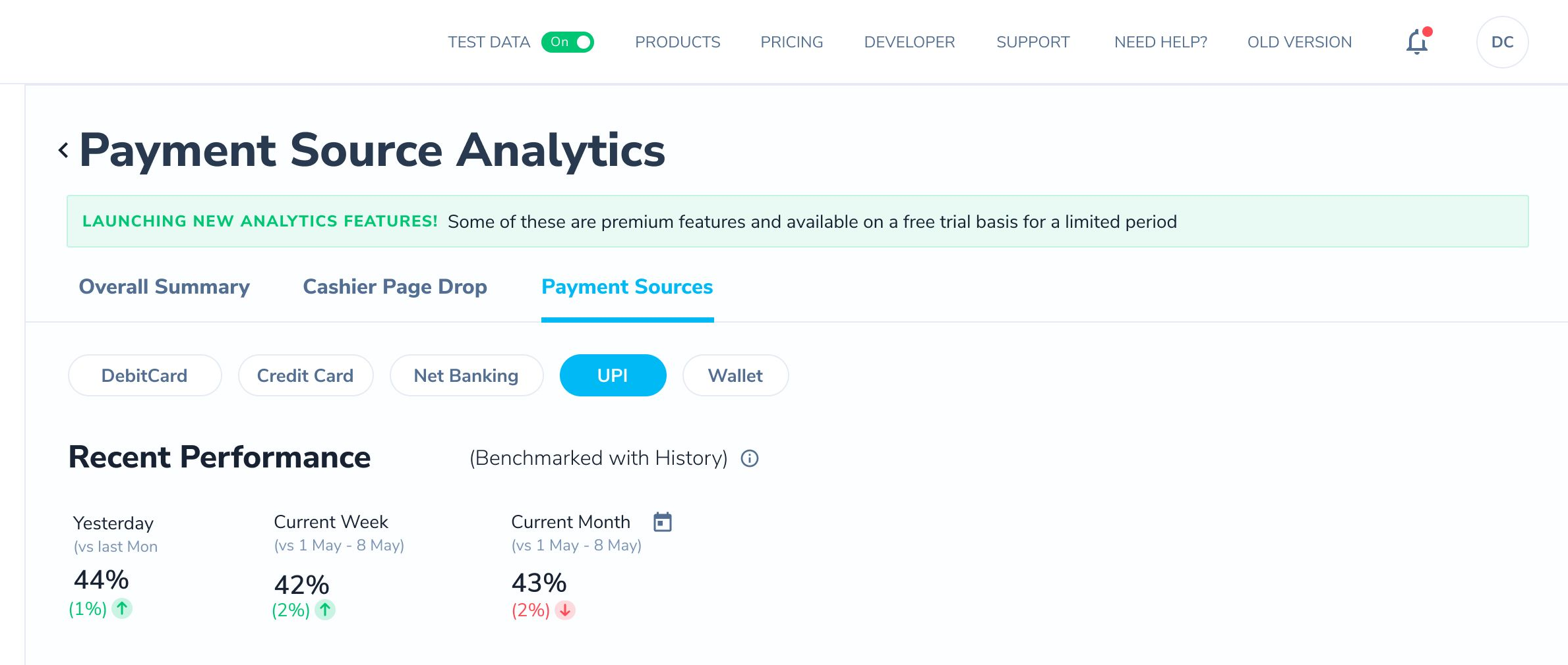
  1. Recent Performance

    This section helps you to understand the recent success rate trends of your selected payment source at an overall level. It also helps you benchmark the payment source success rate across time periods to highlight if there is a sudden rise/dip in the performance of that paymode in recent times.


  2. Success Rate Historic Trend

    This graph has been designed to showcase the success rate trends of your payment source-specific transactions across the chosen time period. 
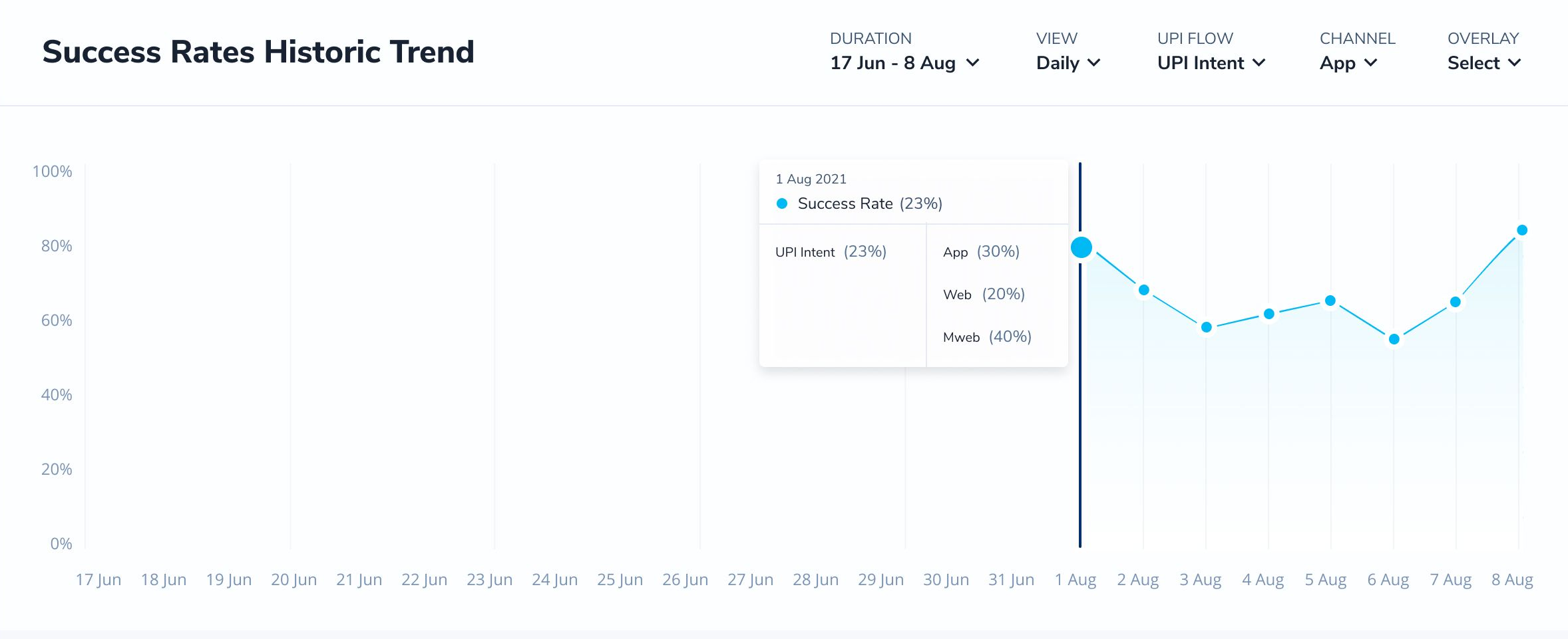


    Here you can apply different filters based on the Payment Source selected: 


    Payment Source Filter Options
      Duration View Card Scheme Issuing Bank Channel Overlay UPI Flow
    Debit Card ✅ ✅ ✅ ✅ ✅ ✅  
    Credit Card ✅ ✅ ✅ ✅ ✅ ✅  
    Netbanking ✅ ✅   ✅ ✅ ✅  
    UPI ✅ ✅     ✅ ✅ ✅


  3. Failure Reasons Summary


    This section helps you understand the overall top reasons for the failure of your transactions specific to the chosen payment source. These failures may have happened by the user, bank, or Router. It also highlights the rise/fall of these failures in recent times as compared to the previous time period.

    Failure Share: This is a doughnut chart that highlights the breakup of failure share across the top five failure reasons and others (which comprises all the remaining failure reasons) in the selected time period for the chosen payment source.

    Top Failure Reasons: This table provides the payment/failure share for the top failure reasons for the selected payment source. These failures/payments shared are benchmarked against previous data for a particular time duration.

    • Yesterday: For the chosen payment source, this shows the payment/failure share for the top failure reasons as well as the increase/decrease in the payment/ failure share for the same day, a week before. 
    • Current Week: For the chosen payment source, this shows the payment/failure share for the top failure reasons as well as the increase/decrease in the payment/ failure share as compared to the previous week. 
    • Current Month: For the chosen payment source, this shows the payment/failure share for the top failure reasons as well as the increase/decrease in the payment/ failure share as compared to the previous month. 


    Depending on the payment source selected, you can apply the following filter on this table: 


    Payment Source Filter Options
      View Card Scheme Issuing Bank Channel UPI Flow
    Debit Card ✅ ✅ ✅ ✅  
    Credit Card ✅ ✅ ✅ ✅  
    Netbanking ✅   ✅ ✅  
    UPI ✅     ✅ ✅


  4. Historic Trend of Failures


This graph depicts the trend of transaction/failure for the selected failure reason across the chosen time period. It can be utilized to further drill down to the specific failure reason trends to find a sudden dip/rise in the failure/transaction share.

You can see the following filters available for the graph for all the payment options: 

  • Duration
  • View
  • Failure Reason
  • Failure Share